R is a programming language for statistical computing. It currently ranks as the 12th most popular language in use today.
R's focus is on statistics, data manipulation and visualization. It has a flourishing, friendly community supporting it with thousands of open-source add-ons (‘packages') with a particular lean towards data science and analytics.
R is free, and available from the Comprehensive R Archive Network (CRAN). This article will use R version 4.1.
For developing code and managing your data science projects, I highly recommend the open source RStudio which provides an excellent integrated development environment (IDE).
If you'd like to avoid all the bother of installing R and RStudio, you can try them both out for free on the web using RStudio CLoud, where you can program right inside your browser.
Within R Studio, you are provided with a console where you can type R commands directly and then see the results.
Within this console, try typing a simple sum and observe the results like so,
1+2
[1] 3
Notice R prints the correct answer 3 to the console, with a bracketed element number [1].
In R, all results are returned as vectors, which can contain multiple values. You can combine multiple values into a longer vector using the c() function,
c(1,2,3)
[1] 1 2 3
Assignment
To store a vector inside of a named variable, R uses the <- operator. For example, to store the character vector "Hello, World!" in a variable called welcome, you would type this,
welcome <- "Hello, World!"
To see the values stored in your welcome variable, you can use the print() function.
print(welcome)
[1] "Hello, World!"
Element Addresses
When storing multiple values in a vector, you may wish to subset that vector and access single or a subset of elements within it.
Lets set up a character vector called fruit
fruit <- c("Apple", "Pear", "Orange")

print(fruit)
[1] "Apple" "Pear" "Orange"
To access elements within the vector, we use the [_index] operator. In R, unlike in python, the index of the vector starts at 1 (Python starts at 0). So to access the second element you would type,
fruit[2]
[1] "Pear"
Data Frames
So far, we have just dealt with 1-dimensional vectors, but in data science we most often deal with tabulated data (like a spreadsheet) with rows and columns.
The data.frame object is the best way to create or store such tabular data. Lets create a few more variables and also a fruit_shop data frame.
fruit_colour <- c("Green", "Green", "Orange")
fruit_price <- c(0.30, 0.50, 0.75)

fruit_shop <-
  data.frame(
    fruit_type = fruit,
    fruit_colour = fruit_colour,
    fruit_price = fruit_price
  )

print(fruit_shop)
  fruit_type fruit_colour fruit_price
1      Apple        Green        0.30
2       Pear        Green        0.50
3     Orange       Orange        0.75
Notice R ignores white space so you're free to break up code into multiple lines to help readability.
To access individual elements of a 2D object such as a data.frame, you can use the same operator [] specifying the rows and columns [row, column]
fruit_shop[1,3]
[1] 0.3
To choose a single column but all the rows, just omit the index for the row,
fruit_shop[,2]
[1] "Green" "Green" "Orange"
For a range of values, you can use the shorthand n:m which produces a vector of integers from n to m inclusive,
fruit_shop[1:2,] # First two rows, all columns
  fruit_type fruit_colour fruit_price
1      Apple        Green         0.3
2       Pear        Green         0.5
Data wrangling in R is the process of importing, analyzing, cleaning and summarizing data. In this section we will take a look at a sample dataset contaning aircraft flights from NYC.
For this section you will need to install the nycflights13 package, which contains the data, and the dplyr package for data manipulation.
You can install both these packages with the following command,
install.packages(c("dplyr", "nycflights13"))
We will the load these packages into our R session
Attaching package: 'dplyr'

The following objects are masked from 'package:stats':

    filter, lag

The following objects are masked from 'package:base':

    intersect, setdiff, setequal, union
And we can take a look at the flights data by printing it to the console
print(flights)
# A tibble: 336,776 x 19
    year month   day dep_time sched_dep_time dep_delay arr_time sched_arr_time
   <int> <int> <int>    <int>          <int>     <dbl>    <int>          <int>
 1  2013     1     1      517            515         2      830            819
 2  2013     1     1      533            529         4      850            830
 3  2013     1     1      542            540         2      923            850
 4  2013     1     1      544            545        -1     1004           1022
 5  2013     1     1      554            600        -6      812            837
 6  2013     1     1      554            558        -4      740            728
 7  2013     1     1      555            600        -5      913            854
 8  2013     1     1      557            600        -3      709            723
 9  2013     1     1      557            600        -3      838            846
10  2013     1     1      558            600        -2      753            745
# ... with 336,766 more rows, and 11 more variables: arr_delay <dbl>,
#   carrier <chr>, flight <int>, tailnum <chr>, origin <chr>, dest <chr>,
#   air_time <dbl>, distance <dbl>, hour <dbl>, minute <dbl>, time_hour <dttm>
Although flights is a type of data frame, the output to the console is much neater than normal. This is because flights is actually a type of data frame called a tibble. The distinction doesn't make any practical difference to our analysis, for our needs it just prints tidier output to the console.
Selecting and Filtering
With dplyr, we can select a subset of columns using the select function. Lets select the month and the year from the dataset like so,
select(.data = flights, month, year)
# A tibble: 336,776 x 2
   month  year
   <int> <int>
 1     1  2013
 2     1  2013
 3     1  2013
 4     1  2013
 5     1  2013
 6     1  2013
 7     1  2013
 8     1  2013
 9     1  2013
10     1  2013
# ... with 336,766 more rows
We can also use dplyrs filter() function to filter the results to some logcial condition. For example, we can filter to only flights in January like so,
filter(.data = flights, month == 1)
# A tibble: 27,004 x 19
    year month   day dep_time sched_dep_time dep_delay arr_time sched_arr_time
   <int> <int> <int>    <int>          <int>     <dbl>    <int>          <int>
 1  2013     1     1      517            515         2      830            819
 2  2013     1     1      533            529         4      850            830
 3  2013     1     1      542            540         2      923            850
 4  2013     1     1      544            545        -1     1004           1022
 5  2013     1     1      554            600        -6      812            837
 6  2013     1     1      554            558        -4      740            728
 7  2013     1     1      555            600        -5      913            854
 8  2013     1     1      557            600        -3      709            723
 9  2013     1     1      557            600        -3      838            846
10  2013     1     1      558            600        -2      753            745
# ... with 26,994 more rows, and 11 more variables: arr_delay <dbl>,
#   carrier <chr>, flight <int>, tailnum <chr>, origin <chr>, dest <chr>,
#   air_time <dbl>, distance <dbl>, hour <dbl>, minute <dbl>, time_hour <dttm>
Pipes
Say we wanted to combine the last two steps to both selecitng only a few columns and then filtering. TO achieve this, we could write,
filter(select(.data = flights, month, year), month == 1)
# A tibble: 27,004 x 2
   month  year
   <int> <int>
 1     1  2013
 2     1  2013
 3     1  2013
 4     1  2013
 5     1  2013
 6     1  2013
 7     1  2013
 8     1  2013
 9     1  2013
10     1  2013
# ... with 26,994 more rows
However, you can see that this isn't very human-readable. It's not too clear what exactly is happening, or what steps are performed in what order. You can imagine with complex data wrangling, this way of writing code will soon become unreadable and hard to maintain.
This is where the pipe operator (%>%) comes in handy. The pipe takes the result of the expression on the left hand side and passes it as the first argument to the right hand side. So the same set of calls becomes,
flights %>%
  select(month, year) %>%
  filter(month == 1)
# A tibble: 27,004 x 2
   month  year
   <int> <int>
 1     1  2013
 2     1  2013
 3     1  2013
 4     1  2013
 5     1  2013
 6     1  2013
 7     1  2013
 8     1  2013
 9     1  2013
10     1  2013
# ... with 26,994 more rows
Here we take flights and pipe it to the select() function. The first argument for select is .data = so flights is passed as this parameter. Within dplyr, all the data functions accept .data = first, so the pipe is extremely powerful to chain commands together.
Mutate
To mutate a data.frame is to change it by adding an additional column. The data for this new column can be a new vector, or it can be some calculation / operation on existing columns.
Lets add a column called distance_km than converts the distance column (in miles) to a distance in kilometers,
flights %>%
  select(carrier, distance) %>%
  mutate(distance_km = 1.61 * distance)
# A tibble: 336,776 x 3
   carrier distance distance_km
   <chr>      <dbl>       <dbl>
 1 UA          1400       2254
 2 UA          1416       2280.
 3 AA          1089       1753.
 4 B6          1576       2537.
 5 DL           762       1227.
 6 UA           719       1158.
 7 B6          1065       1715.
 8 EV           229        369.
 9 B6           944       1520.
10 AA           733       1180.
# ... with 336,766 more rows
Summarise
We may also want to summarise data by performing some aggregations on the data. For this, we use the summarise() function.
flights %>%
  select(carrier, distance) %>%
  mutate(distance_km = 1.61 * distance) %>%
  summarise(avg_distance = mean(distance_km))
# A tibble: 1 x 1
  avg_distance
         <dbl>
1        1674.
In this case, we summarise all the rows to find the mean distance in kilometers for the whole dataset.
Groups
So far, we have selected, filtered and summarised the flights dataset as a whole. However, we may wish to perform these operations on groups of data within the dataset.
For example, what is the average distance per company? dplyr lets you group the dataset based on one or more of it's columns, and then all subsequent ooperations will be done group-by-group.
As an example, lets get the mean distance per carrier,
flights %>%
  select(carrier, distance) %>%
  mutate(distance_km = 1.61 * distance) %>%
  group_by(carrier) %>%
  summarise(avg_distance = mean(distance_km))
# A tibble: 16 x 2
   carrier avg_distance
   <chr>          <dbl>
 1 9E              854.
 2 AA             2158.
 3 AS             3867.
 4 B6             1720.
 5 DL             1991.
 6 EV              906.
 7 F9             2608.
 8 FL             1070.
 9 HA             8023.
10 MQ              917.
11 OO              806.
12 UA             2462.
13 US              891.
14 VX             4024.
15 WN             1604.
16 YV              604.
Base Plotting
R's inbuilt plot() function can create visualizations of your data. It's pretty good, but you should be aware there are some far more powerful graphing options available via packages that we'll cover later.
Lets plot a data frame. R has some in-built data sets that are really useful for quick experiments. Lets try plotting one of these in-built data frames, the Orange data set. This data set contains observations of several Orange trees over time, and their trunk circumference. We can take a look by printing the Orange data set to the console.
Orange
   Tree  age circumference
1     1  118            30
2     1  484            58
3     1  664            87
4     1 1004           115
5     1 1231           120
6     1 1372           142
7     1 1582           145
8     2  118            33
9     2  484            69
10    2  664           111
11    2 1004           156
12    2 1231           172
13    2 1372           203
14    2 1582           203
15    3  118            30
16    3  484            51
17    3  664            75
18    3 1004           108
19    3 1231           115
20    3 1372           139
21    3 1582           140
22    4  118            32
23    4  484            62
24    4  664           112
25    4 1004           167
26    4 1231           179
27    4 1372           209
28    4 1582           214
29    5  118            30
30    5  484            49
31    5  664            81
32    5 1004           125
33    5 1231           142
34    5 1372           174
35    5 1582           177
We see this data frame has three columns, a Tree id that identifies which tree, the age of the tree (in days), and the tree's circumfrance. Tosee information on the data set, or indeed any function, you can quickly bring up the help by typing ?Orange.
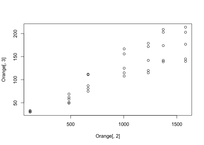
Lets plot this data frame so see the relationship between age and circumfrance. For this we'll select column 2 for the x-axis and column 3 for the y axis.
plot(Orange[,2], Orange[,3])
Not a bad start, but we can do better. Firstly, lets make our code more readable by using a different way of selecting columns.
For data frames, we can use the $ operator to refer to a column by it's name, rather than it's index.
plot(Orange$age, Orange$circumference)
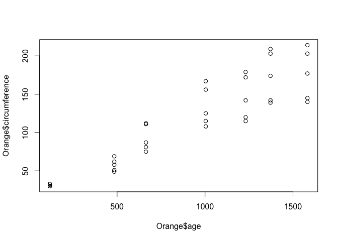
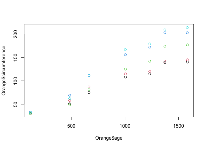
Ok, not much change to the graph, except the axis labels are a little more helpful. Now, lets colour the points by the tree which the observation came from. We do this by passing the col = parameter to the plot() function.
plot(Orange$age, Orange$circumference, col = Orange$Tree)
There are lots of other base plotting functions in R, such as barplot(), boxplot() and hist(). However, the majority of data scientists forego the base plotting in favor of an open source alternative called ‘ggplot'.
ggplot
The ggplot package stands for the grammar of graphics plots. It's design is based on a book by Leland Wilkinson called, unsurprisingly, The Grammar of Graphics. It was created by Hadley Wickham, who is now the chief data scientist as RStudio, and is one of the R community's most prolific contributors.
To use a package, we must first install it. To install packages into R, you use the install_packages() function.
install.packages("ggplot2")
We then need to load a package into our R session, which we do like so,
library(ggplot2)
Lets explore how ggplot works. The philosophy of ggplot is that a plot is made of elements that should be separately controlled. We have things like the scales on the axis, the geometries we use to represent the data (such as points for scatter plots, lines for trends or bars for barcharts),
Lets start by plotting our Oranges,
library(ggplot2)

ggplot(data = Orange, mapping = aes(x = age, y = circumference, colour = Tree)) +
  geom_point() +
  geom_line()
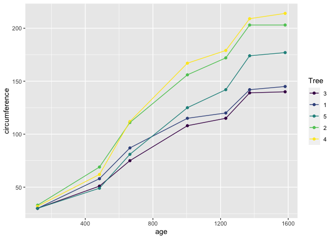
Lets break down this bit of code.
- In the first line of this call, the first argument we pass to
ggplot()is always the data, the second argument wrapped in theaes()function are called the aesthetics, which define how the data is mapped to elements of the chart. - We've mapped here the
xvalues toage, theyvalues tocircumference, and thecolourvalues to theTree. (The american spellingcolor=is also acceptable). - In the subsequent lines, we have added using the
+operator different geometries to represent our data, such as points and lines. These points and lines inherit the aesthetics, so they know what x, y, and colour values they should be using to be consistent with the data.
ggplot is far more powerful that base graphics when plotting complex charts thanks to this simple separation between the data and the chart elements.
Lets try a more complex examples using the example data set from ggplot, diamonds.
ggplot(
  data = diamonds,
  mapping = aes(
    x = price,
    fill = cut
  )
) +
  geom_histogram()
`stat_bin()` using `bins = 30`. Pick better value with `binwidth`.
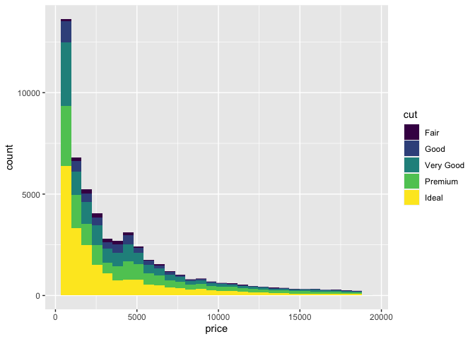
In this example, we mapped the price of a set of diamonds to x, and the fill colour to the quality of the diamond's cut. We then added a histogram geometry to get the resulting histogram plot.
Lets try mapping other aesthetics,
ggplot(
  data = diamonds,
  mapping = aes(x = carat, y = price, color = color, shape = cut)
  ) +
  geom_point()
Warning: Using shapes for an ordinal variable is not advised
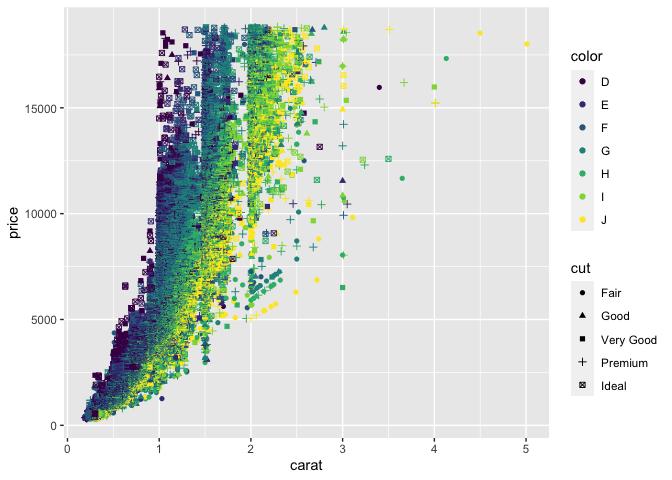
Here we've mapped x, y, shape, colour and the quality of cut to various aesthetics that have then been used in the geom_point() geometry.
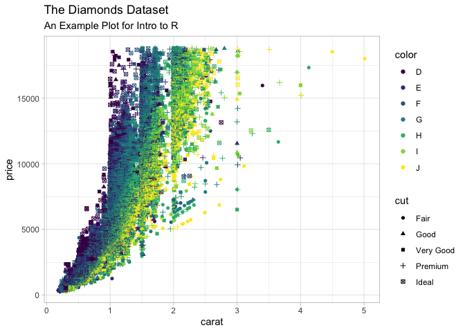
Lets just quickly this plot up by adding labels and a theme
ggplot(
  data = diamonds,
  mapping = aes(x = carat, y = price, color = color, shape = cut)
  ) +
  geom_point() +
  labs(
    title = "The Diamonds Dataset",
    subtitle = "An Example Plot for Intro to R",
  ) +
  theme_light()
Warning: Using shapes for an ordinal variable is not advised
In this section we are going to demonstrate the machine learning capabilities of R using the tidymodels package.
The tidymodels package is relatively new, and is a ‘meta package' that wraps up lots of machine learning packages with a common API.
This makes switching between models and methods really easy, even if the underlying packages they are based on behave very differently. Most of this functionality is actually provided by a tidymodels package, parsnip.
Get the Data
Duration 15
For this simple example to demonstrate the power of ML in R, I have prepared and pre-processed some data for us. We will be using a prepossessed version of the palmerpenguins dataset.
The pre-processed versions we will be using can be downloaded from gitlab. There are two files, one for analysis/training the model, and one file of independent observations for assessment/testing the model.
Alternatively, and encouraged, you can load these files directly into R using their URLS like so
library(readr)

df_analysis <-
  read_csv("https://raw.githubusercontent.com/tjconstant/penguins/main/penguins_analysis.csv") %>%
  mutate(species = as.factor(species))
Rows: 258 Columns: 8

── Column specification ────────────────────────────────────────────────────────
Delimiter: ","
chr (3): island, sex, species
dbl (5): bill_length_mm, bill_depth_mm, flipper_length_mm, body_mass_g, year


ℹ Use `spec()` to retrieve the full column specification for this data.
ℹ Specify the column types or set `show_col_types = FALSE` to quiet this message.
df_assesment <-
  read_csv("https://raw.githubusercontent.com/tjconstant/penguins/main/penguins_assessment.csv") %>%
  mutate(species = as.factor(species))
Rows: 86 Columns: 8

── Column specification ────────────────────────────────────────────────────────
Delimiter: ","
chr (3): island, sex, species
dbl (5): bill_length_mm, bill_depth_mm, flipper_length_mm, body_mass_g, year


ℹ Use `spec()` to retrieve the full column specification for this data.
ℹ Specify the column types or set `show_col_types = FALSE` to quiet this message.
We have also changed the species column type to a factor rather than a character. Factors are useful for categorical types of data and is expected by most of tidymodels functions.
Choosing a Classifier
For starters, we are going to use a Decision Tree classifier to attempt to predict the species of the penguins based on the other variables.
To set up a classifier we will create a model object like this,
library(tidymodels, quietly = TRUE)
Registered S3 method overwritten by 'tune':
  method                   from
  required_pkgs.model_spec parsnip

── Attaching packages ────────────────────────────────────── tidymodels 0.1.3 ──

✓ broom        0.7.8      ✓ rsample      0.1.0
✓ dials        0.0.9      ✓ tibble       3.1.2
✓ infer        0.5.4      ✓ tidyr        1.1.3
✓ modeldata    0.1.1      ✓ tune         0.1.6
✓ parsnip      0.1.7      ✓ workflows    0.2.3
✓ purrr        0.3.4      ✓ workflowsets 0.1.0
✓ recipes      0.1.16     ✓ yardstick    0.0.8

── Conflicts ───────────────────────────────────────── tidymodels_conflicts() ──
x purrr::discard()  masks scales::discard()
x dplyr::filter()   masks stats::filter()
x dplyr::lag()      masks stats::lag()
x yardstick::spec() masks readr::spec()
x recipes::step()   masks stats::step()
• Use tidymodels_prefer() to resolve common conflicts.
classifier <-
  decision_tree(mode = "classification") %>%
  set_engine("rpart")
Note you may need to install rpart package for using the decision tree example above.
Fitting the Model
To fit the model, we call the fit command.
model <- fit(classifier, formula = species ~ ., data = df_analysis)
We specify the classifier (The Decision Tree). We also provide a formula telling the fit function what we are predicting and what to use as predictors. For this formula we specify the species column as the output, and use the shorthand species ~ . to indicate that everything else should be used as the predictors.
If we wanted to try and predict the species based solely on island and sex (a poor idea!), we would instead write species ~ island + sex.
Evaluate the model
We now assess the model based on data it has not previously seen, and deduce the accuracy of our model.
For this, we use our trained model to predict the species from the df_assessment data frame.
df_pred <- predict(model, new_data = df_assesment)

df_pred
# A tibble: 86 x 1
   .pred_class
   <fct>
 1 Adelie
 2 Adelie
 3 Chinstrap
 4 Adelie
 5 Adelie
 6 Adelie
 7 Adelie
 8 Adelie
 9 Adelie
10 Adelie
# ... with 76 more rows
Notice only the predictions are returned in a single column names .pred_class. It will be more useful to have the original df_assessment appended, so instead we can bind the columns together using bind_cols.
df_pred <-
  df_assesment %>%
  bind_cols(
    predict(model, new_data = df_assesment)
  )

df_pred
# A tibble: 86 x 9
   island  bill_length_mm bill_depth_mm flipper_length_... body_mass_g sex    year
   <chr>            <dbl>         <dbl>            <dbl>       <dbl> <chr> <dbl>
 1 Torger...           40.3          18                195        3250 fema...  2007
 2 Torger...           36.6          17.8              185        3700 fema...  2007
 3 Torger...           46            21.5              194        4200 male   2007
 4 Biscoe            35.9          19.2              189        3800 fema...  2007
 5 Biscoe            38.2          18.1              185        3950 male   2007
 6 Biscoe            40.6          18.6              183        3550 male   2007
 7 Dream             37.2          18.1              178        3900 male   2007
 8 Dream             39.8          19.1              184        4650 male   2007
 9 Dream             37            16.9              185        3000 fema...  2007
10 Dream             39.6          18.8              190        4600 male   2007
# ... with 76 more rows, and 2 more variables: species <fct>, .pred_class <fct>
To test the accuracy of this model, we can pass the resulting data frame to accuracy.
df_pred %>%
  accuracy(truth = species, estimate = .pred_class)
# A tibble: 1 x 3
  .metric  .estimator .estimate
  <chr>    <chr>          <dbl>
1 accuracy multiclass     0.953
Abut 95% accuracy! Not bad!
Improving the model
One of the great things about tidymodels (and under the hood parsnip), is the method of building the model is the same whichever model we try an run.
For example, instead of a decision tree, why don't we try a Random Forest?
The following code chunk is identical to the commands above, except for the classifer <- line. We also need to install the Random Forest library ranger before running this code.
classifier <-
  rand_forest(mode = "classification") %>%
  set_engine("ranger")

model <- fit(classifier, formula = species ~ ., data = df_analysis)

df_pred <-
  df_assesment %>%
  bind_cols(
    predict(model, new_data = df_assesment)
  )

df_pred %>%
  accuracy(truth = species, estimate = .pred_class)
# A tibble: 1 x 3
  .metric  .estimator .estimate
  <chr>    <chr>          <dbl>
1 accuracy multiclass     0.988
98%! Very good. Lastly (since it's so easy!), lets tre a Gradient Boosted tree. Again, this code is identical except for the classifier. For this classifier you need to install the xgboost library.
classifier <-
  boost_tree(mode = "classification") %>%
  set_engine("xgboost")

model <- fit(classifier, formula = species ~ ., data = df_analysis)
[11:26:43] WARNING: amalgamation/../src/learner.cc:1095: Starting in XGBoost 1.3.0, the default evaluation metric used with the objective 'multi:softprob' was changed from 'merror' to 'mlogloss'. Explicitly set eval_metric if you'd like to restore the old behavior.
df_pred <-
  df_assesment %>%
  bind_cols(
    predict(model, new_data = df_assesment)
  )

df_pred %>%
  accuracy(truth = species, estimate = .pred_class)
# A tibble: 1 x 3
  .metric  .estimator .estimate
  <chr>    <chr>          <dbl>
1 accuracy multiclass         1
100%!!!
OK, so any Data Scientist should be wary of perfect accuracy, and we should thoroughly check these models using techniques like cross-validation. But hopefully this gives you an idea of the power of tidymodels and parsnip.
There is lots of other features of tidymodels I haven't covered here like pre-processing using the recipies packages, building ML pipelines using workflow, Auto ML type analysis using workflowsets and all the different sampling and cross-validation techniques. But common to all these packages that are part of tidymodels is they follow a common API structure and can be swapped in and out with little changes to your code.